This free eBook goes over the 10 slides every startup pitch deck has to include, based on what we learned from analyzing 500+ pitch decks, including those from Airbnb, Uber and Spotify.
Everything you need to raise funding for your startup, including 3,500+ investors, 7 tools, 18 templates and 3 learning resources.
Buy It For $97 $297 →
As of 2025, Uber operates in over 70 countries and more than 15,000 cities, offering ride-hailing, food delivery, package delivery, and even freight services. But this global giant started as a simple idea pitched in 2008 by founders Garrett Camp and Travis Kalanick. Back then, Uber was envisioned as a luxury alternative to traditional taxis, and it all began with a single pitch deck.
That deck became Uber’s gateway to raising its first $200K in funding, setting the stage for one of the most remarkable startup journeys in history.
Today, Uber’s pitch deck is studied by entrepreneurs like us as a prime example of early-stage fundraising done right. In this article, we’ll break down Uber’s original pitch deck slide by slide, analyzing the strategies and storytelling techniques that helped transform a bold idea into a transportation revolution.
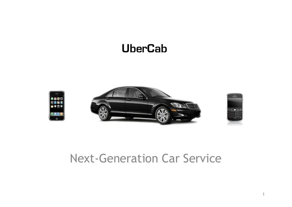
The first thing you’ll notice on slide one of the pitch deck is that Uber was originally known as UberCab.
Below the company’s original name is an image of a black Mercedes Benz, flanked on either side by an iPhone and a Blackberry. These images subtly allude to the original intention behind Uber, which was to create a luxury taxi alternative targeted at business professionals.
The last thing on Uber’s original pitch deck’s first slide is the phrase “Next-Generation Car Service,” a tagline about what the service was aiming to be to give potential investors an idea of what was to come in the following slides.
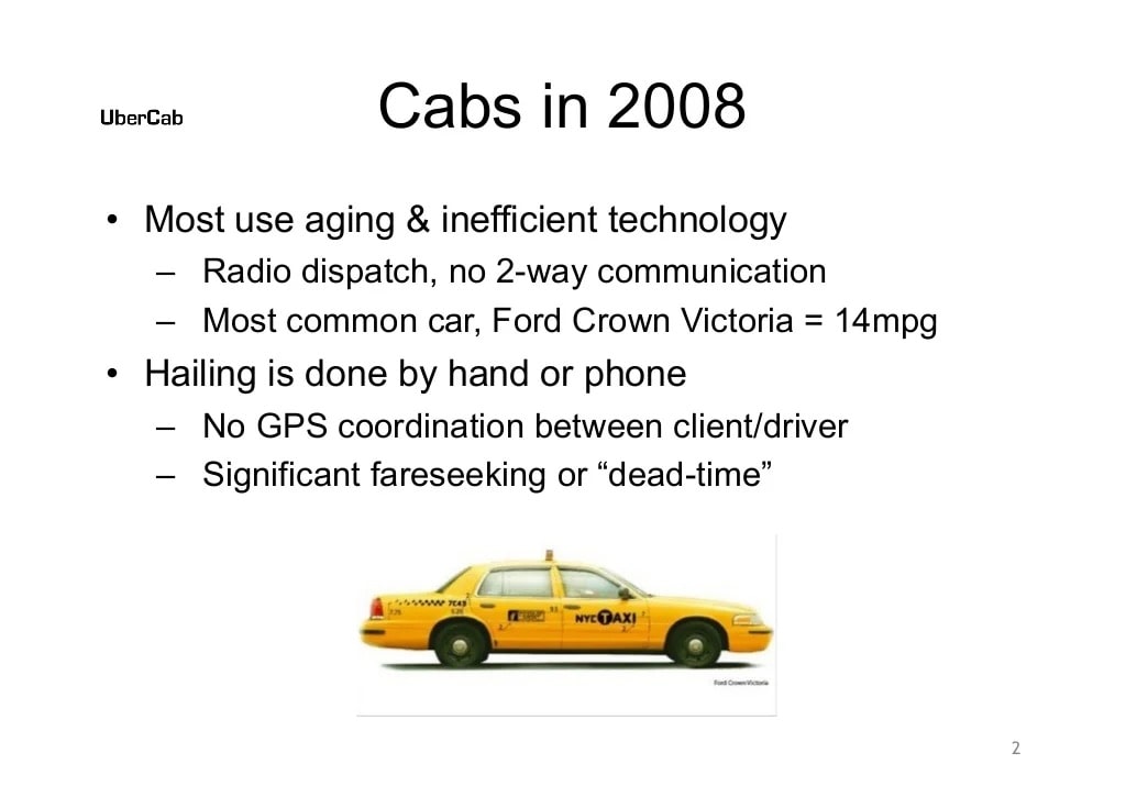
The second slide in Uber’s pitch deck starts to explain the problems with taxi services in 2008. It mentions aging fleets and inefficient technology, including reliance on radio dispatch technology and the need to hail a taxi by calling a dispatch or flagging one down by hand.
The slide also mentions problems faced by cab drivers, including the lack of any type of GPS coordination for pickups and the significant amounts of dead time spent without any fares.
Ride-sharing services like Uber and those that came after it have drastically changed the face of ride hailing over the last 10+ years, but try to think back to how much more complicated getting a cab was in 2008. This slide laid out the problems with taxis in simple terms that most potential investors could easily relate to back then.
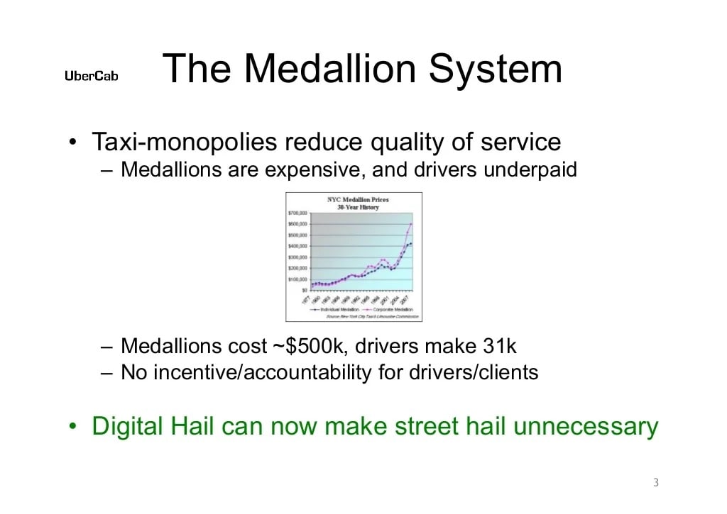
Uber’s third slide continued explaining the problems with taxi services, specifically how taxi monopolies reduced the quality of cab services, how expensive it was for new drivers to get into the industry, and how little drivers were paid. It also mentioned how there were no incentives for either customers or cab drivers to hold them accountable during rides.
The last sentence on the slide coins a term that would foreshadow what was to come: “Digital Hail,” or a new way to hail cabs digitally and avoid the need to do so in the street. You can see that, by only the third slide, potential investors should have now been very keen to find out what Uber’s solutions to these problems within the ride hailing sector were going to be.
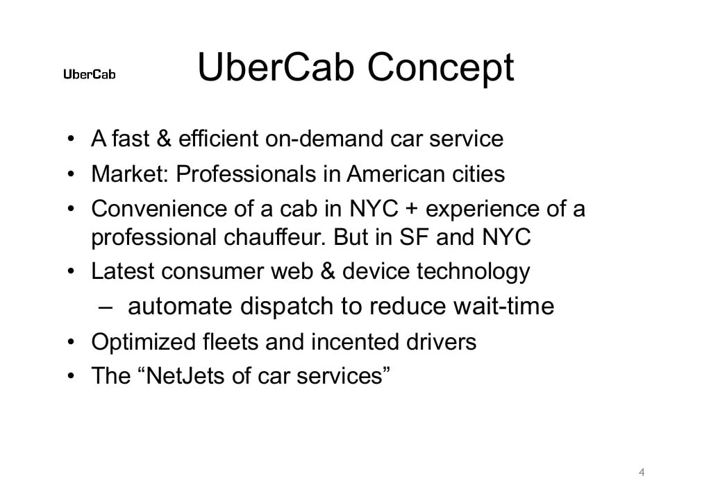
With potential investors now ready to hear about how Uber planned to disrupt the taxi industry, the next slide in the pitch deck introduced the company’s concept in detail.
The founders pitched Uber as “a fast & efficient on-demand car service,” as well as introduced their target market as professionals in American cities, starting with San Francisco and New York.
The fourth slide also goes on to start explaining how the service will solve some of those previously mentioned problems, including shortening wait times and incentivizing drivers.
You can see in this slide that Uber was originally really focused on pitching a luxury service, similar to what Uber Black is today, to provide a chauffeur-like experience with the convenience of an on-demand cab. Though the initial concept didn’t stick, this would have been interesting to potential investors, as nothing like this existed at the time.
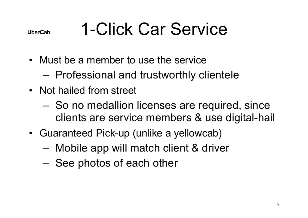
The next Uber pitch deck slide continued to explain the concept, providing easily-digestible details about how the service would actually work.
The information on this slide directly addresses more of the problems that the deck already mentioned, stating how Uber would be a members only service and establish high levels of trust between clients and drivers, while allowing drivers to work without the high costs associated with driving traditional taxis.
Overall, the length of the information in the pitch deck about Uber’s solution runs a little long. They could have condensed slides four and five into one shorter slide and still gotten the point across.
According to Y Combinator, seed round pitch decks should explain what your company does very clearly, in as few words as possible, and describe the concrete benefits your concept provides. The Uber deck’s slides on their solution are slightly too wordy and could have provided a briefer, more high-level look at the concept.
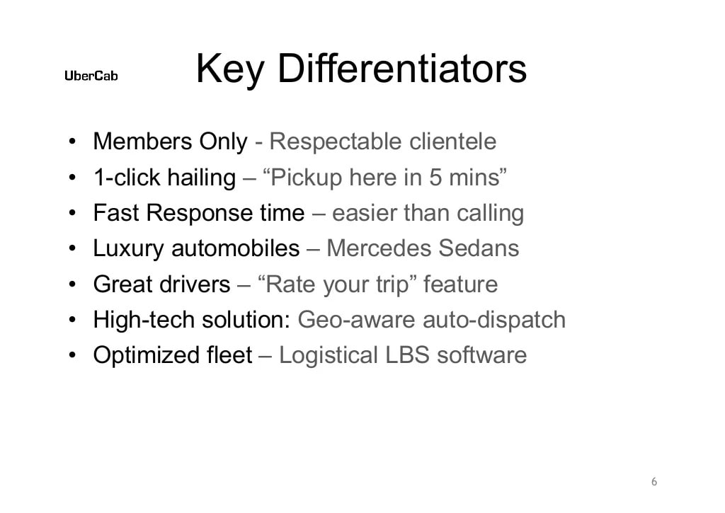
On the sixth slide, Uber’s founders used short bullet points to lay out their concept’s key differentiators in a way potential investors could easily digest. Specifically, the Uber founders are comparing their company to traditional cab companies.
When you’re pitching an idea for a startup to raise funding, slides like this are incredibly important because they allow your audience to skim them and gain a quick understanding of what your idea is and how it is different compared to competitor businesses in the same niche.
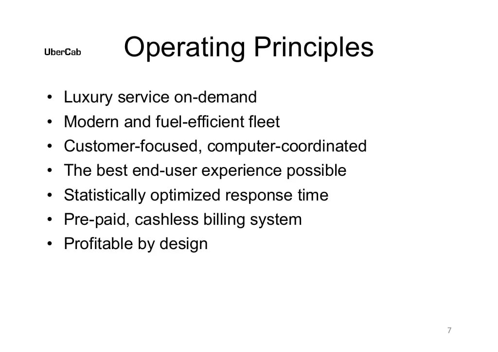
The seventh slide is a place where Uber’s pitch starts to look a little dated. This slide also uses bullet points, but they make somewhat general claims about how the service will operate with no supporting information to back them up.
Phrases like “statistically optimized response time” and the “the best end-user experience possible” show that Uber’s founders had big ambitions, but they fall a little flat here without any elaboration. This was probably an unnecessary slide, or at least one that could have been executed better.
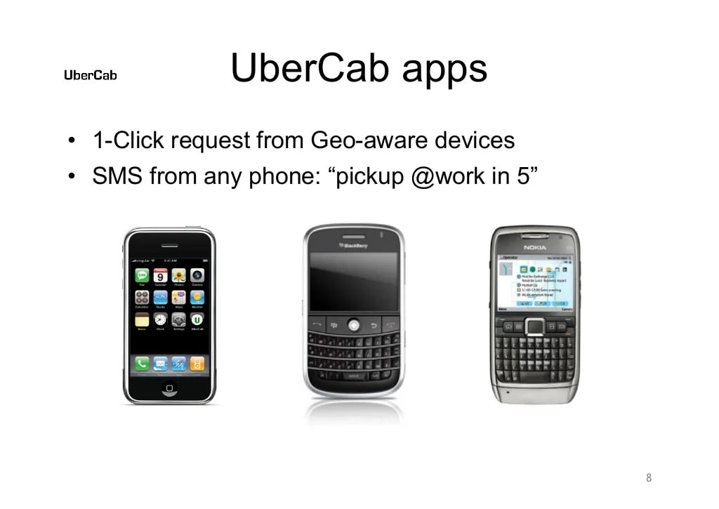
The next slide states that Uber will work using a 1-click request app from geo-aware devices, such as those pictured below the text. This slide also says that you would be able to send an SMS text to request a pickup from any phone, which is something that never manifested.
Another thing to note about slide eight is that it doesn’t include real mockups of what the Uber app would look like. If you’re going to include images of devices that an app is going to function on, the best practice is to edit them to show a mockup of one or more screens of the app.
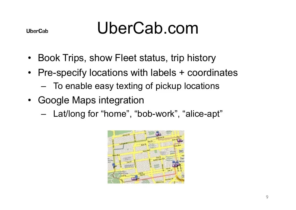
The ninth Uber pitch slide explains how the services website would work, stating that you would be able to book pre-scheduled trips and set default pickup locations, such as “home” and “work.”
At the time, these would have been exciting features for potential investors to hear about because there were no other online services that allowed people to schedule rides and store GPS information about their locations for ease of use.
The image on this slide also gave the audience a sneak-peak of how users could view the locations of nearby Uber fleet drivers, which was a nice visual touch.
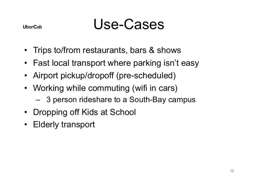
Next, we see another text-only slide that uses clear, concise bullet points to illustrate potential use cases for Uber. There’s nothing too surprising here, and the use cases are all pretty plausible, other than the bullet point about working while commuting with in-car WiFi — this is another feature from the original luxury ride concept for Uber that never came to life.
Other than the WiFi, all the use cases on this slide are things people use Uber for today. Use cases like these are very important to include in any pitch deck to help potential investors envision where your product can fit into the market and how people will actually use it.
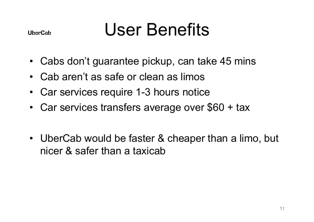
The 11th slide in Uber’s original pitch deck is a bit confusing. It starts off with saying “cabs don’t guarantee pickup,” which doesn’t seem like it’s necessarily true. After all, if you call a cab service and request a pickup, they will dispatch a car to you, though it’s true that it can take a long time for them to arrive.
The other points about car services being slow and expensive are true enough, and the slide concludes by framing Uber as a sort of happy medium between a taxi and a limo service. Overall, this is another slide that could have probably been left out or done differently, as the user benefits should have already been pretty clear from earlier slides.
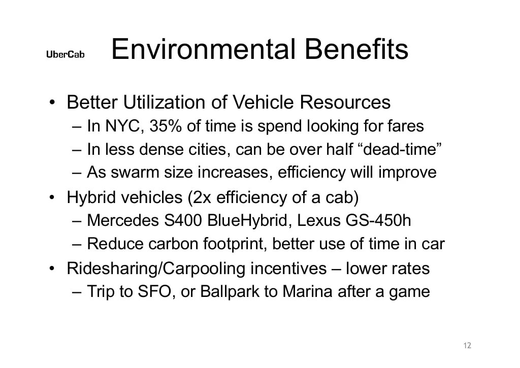
In slide 12, Uber’s founders emphasize how Uber will have a positive effect on the environment. They stated that, since drivers don’t have to drive around searching for fares, vehicle resources would be used more efficiently. The slide also mentions the use of more efficient hybrid vehicles and the option to carpool with other riders to reduce carbon footprints.
This is all good information to include in a pitch deck, as many prospective investors want to know what the environmental impact of your business could potentially be. Concern about the environment has certainly grown since 2009, too, so environmental impact info is more important than ever.
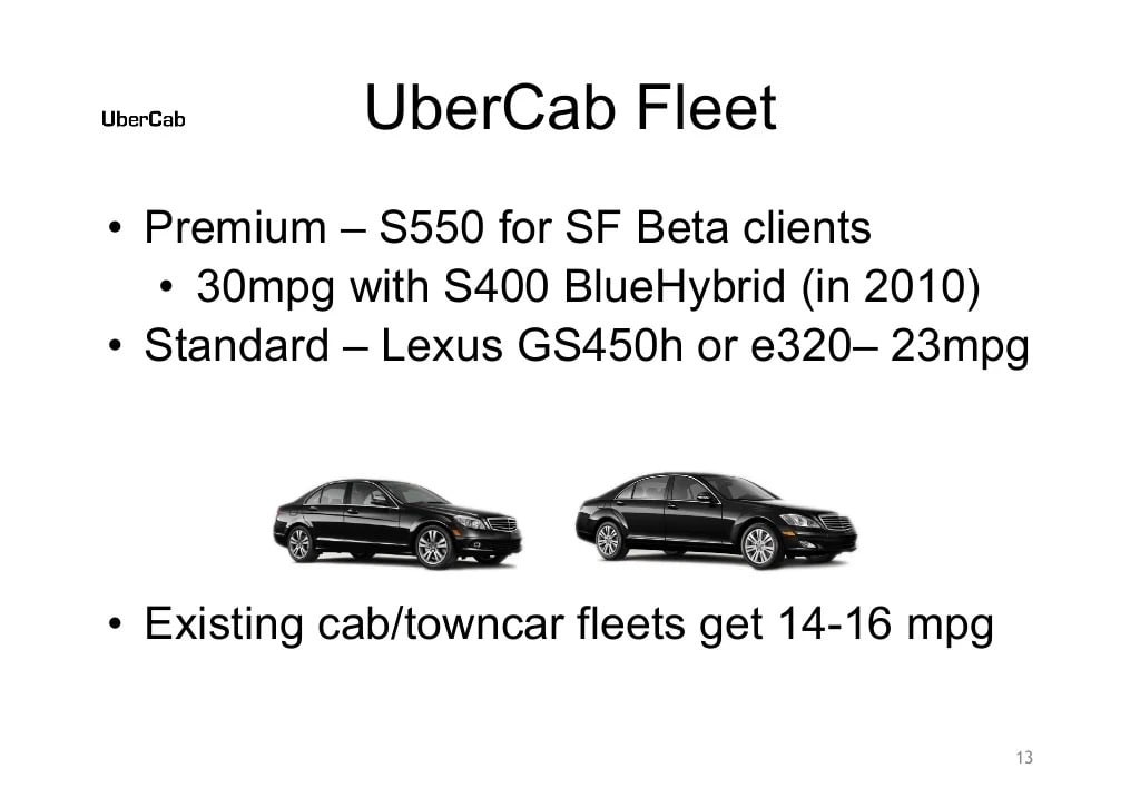
Moving on to slide 13, we see some information about the cars Uber originally intended to use for their fleet, which also supports some of the environmental information from the previous slide by showing the fuel efficiency of the cars.
It seems that Uber’s founders originally intended to own their driver’s cars, or at least regulate what types of cars they could use. As you probably know, Uber vehicles now come in all shapes and sizes, so this is another initial plan that didn’t come to fruition. This slide was perhaps a little too specific and didn’t really seem to add a lot to the pitch.

There’s not a lot to take in on the 14th slide. It includes important information about where Uber would operate initially, which was to be San Francisco followed by New York. This is important information for investors to know because it’s a common practice for startups to test their product in a specific niche or market before growing to others, and the market or niche they choose can affect investors’ decisions.
In the case of Uber, opting to start out in major US cities on the East and West Coasts, both of which have large potential customer bases of business people, was a well-calculated decision that surely contributed to the company’s initial success.
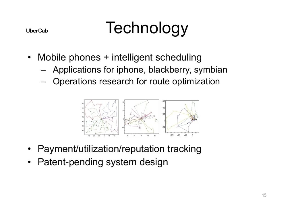
On slide 15, the Uber pitch deck elaborates a bit more on the technology the company planned to use. Though the bullet points are kind of vague, this slide likely provided some important talking points for the presenters.
However, it’s a good practice for pitch decks to only contain information that can be understood at a glance, without requiring it to be presented by founders. Pitch decks generally get shared between and referred back to by investors and other stakeholders, so it’s important that all the information in them makes sense without someone talking about them and providing context and explanations.

This slide offers some more technological information about how Uber’s fleet cars would sit in optimal locations to minimize expected pickup times based on things like the day, time, weather, and traffic conditions. This is another thing that changed, since Uber doesn’t control where their drivers wait to pick up fares, but it was likely an interesting concept to investors, since traditional taxi companies did not employ any such AI-based tech.
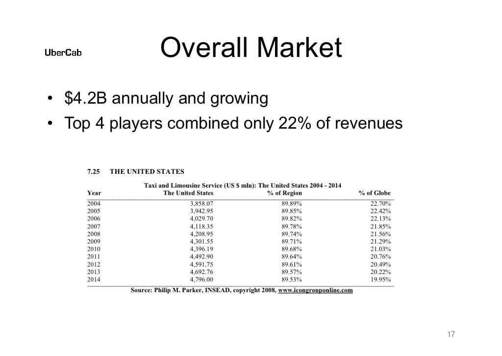
Uber’s 17th slide provides information about the size of the taxi and limousine service market’s revenue.
The idea with a slide such as this one is to convince investors that your startup is in a large enough market for it to at least grow into a unicorn (a company valued at $1B+), which is what most venture capitalists are interested in investing in.
The numbers here are just an estimate of the market size and they will almost never be 100% accurate, but the main point is to tell investors a data-backed story about the market in which your startup business operates (here’s a short guide on how to estimate market size).
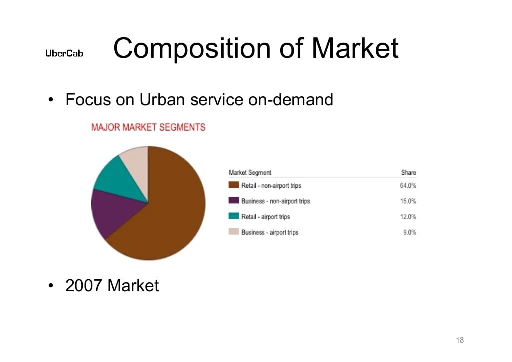
The next slide shows a pie chart breaking down the percentage of rides to the airport vs. those not to the airport, and the percentage of those that are for retail vs. business. It’s not clear how this affected Uber’s concept, so this perhaps wasn’t a particularly necessary slide.
If you’re going to include a slide like this in your pitch deck, it’s better to at least have a couple of bullet points explaining how the data relates to your project and opportunities. Remember that you want anyone who skims through your deck to understand it without needing you to give them an explanation.

On slide 19, the Uber pitch deck repeats that the initial target cities were intended to be SF and NYC. The slide then lists a few other major cities to expand to. This slide could have easily been combined with the Initial Service Area slide from earlier in the pitch for conciseness.
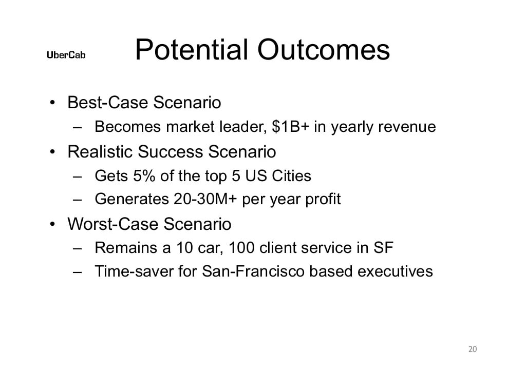
The 20th slide of Uber’s pitch deck lists potential outcomes of the company’s business model.
The best-case scenario that the founders speculated on was that the company would become a market leader and make $1B+ in annual revenue. The worst-case scenario was that the company wouldn’t achieve its goal of expanding beyond San Francisco, and that it would remain a small, high-end transportation service for executives in the city.
This is an important slide for investors to see because it gives them some realistic possibilities for what can happen if they invest, helping them to make a decision about backing the startup.
Though it took until 2015 to start earning over $1B in annual revenue, Uber now pulls in more than $14B annually. So it’s safe to say their best-case scenario eventually came true.
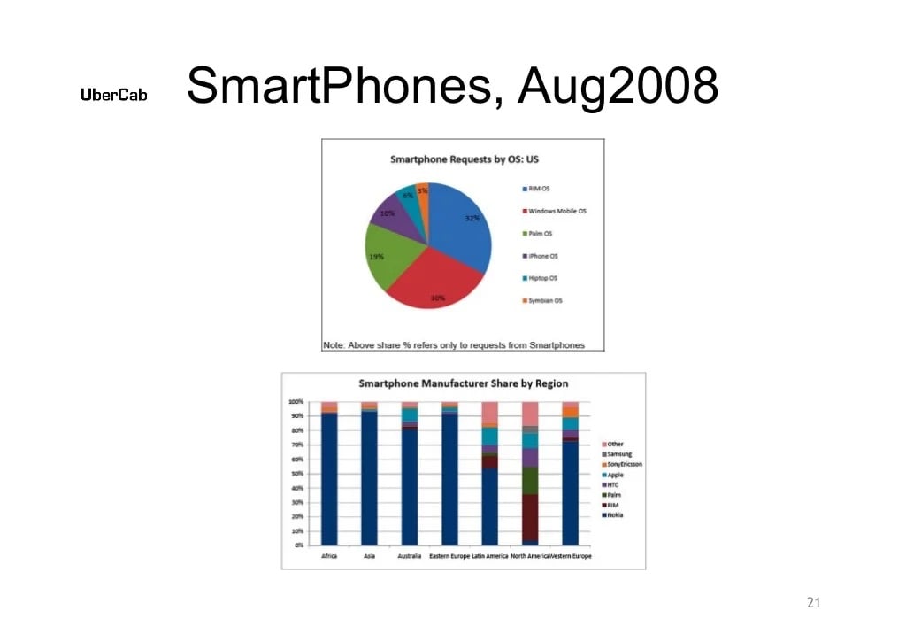
The next slide shows a couple of charts about smartphone usage in the US as of August 2008. This just provided potential investors some relevant stats about the ever-growing opportunities for mobile apps.
From today’s perspective, you might think this is another unnecessary slide. But, you have to remember that when Uber was conceived, in 2008, it was far less common for people to order things like cabs through their smartphones.
Uber’s founders added this slide to show how smartphone usage was growing back then, as a way to back their market size and potential outcome estimations to investors.
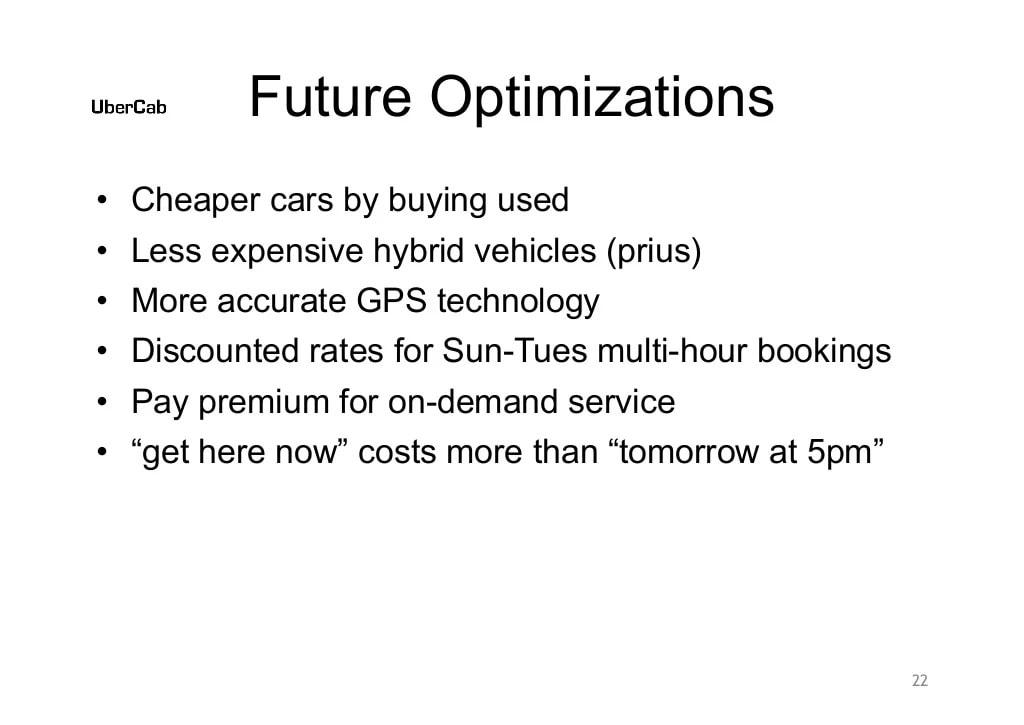
On slide 22, the deck goes into some ideas for optimizing the Uber app down the road. This is extra information that some investors may have appreciated, but it feels like it could have been left out of Uber’s first pitch deck and saved for a later funding round when the app was actually up and running.

On the following slide, we see some potential ideas for how to market Uber’s service. This slide feels a bit like a sheet of notes from a brainstorming session. It probably would have been better to include concrete marketing activities planned for the app’s launch.
Showing investors some of the different ideas you have for growing an early-stage business isn’t a bad idea, but it would work better if you’re able to show them active growth strategies and channels, instead of a random assortment of unconnected marketing ideas.

The second-to-last slide in Uber’s pitch deck states their plans to eventually expand the app’s infrastructure to other location-based services, such as delivery. If you’ve ever used Uber Eats, you know this is something that came true! This is a good slide to include at the end of a pitch because it leaves investors thinking about the company’s potential for growth.
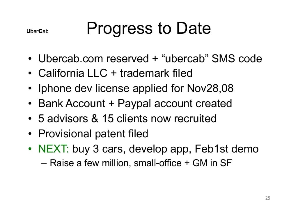
Last but not least, we have a slide with some bullet points listing everything Uber had done to date to bring its vision to life. This is definitely important information to show potential investors, who want to see progress being made in order to actually commit money to a project.
Uber’s founders didn’t include any type of slide in their original pitch deck about the business model, with concrete details about pricing, operating costs, profit margins, and other information investors like to know. Even if they’re just initial estimates, it’s good to include a slide with at least some of this information in your startup pitch.
These days, it’s a best practice to include a slide with a brief summary of the key team members, including the founders and anyone else vital to the development of the project. This puts a face to the company for investors and gives them a better idea of how qualified the team is to solve the problem they claim to be able to solve.
A slide with info about deal terms isn’t necessarily a standard slide to include in pitch decks, but some investors appreciate having this information during a presentation. Deal terms can include things like how much money your company needs initially to kickstart it and what investors could expect in return.
If you like the way Uber’s original pitch deck worked and think you could try something similar for your next startup fundraising pitch, you can try using one of the editable Uber pitch deck PDF templates below:
If you do try out one of the pitch deck templates above, consider removing and/or combining some of the slides to cut down the overall length of the presentation and make the info more concise.
Today, there are more startups than ever for investors to choose from, so you really want to make your first pitch pack a punch in a short amount of time and include only the most relevant information.
Overall, Uber’s pitch deck did lots of things well, though it could have been shorter. The recommended length for startup pitch decks is 12 to 14 slides, and Uber’s deck was a whopping 25 slides long.
Where Uber’s founders could have really cut down the length of the deck was in the slides about the company’s app and solution. They should have described the solution and the user benefits of using Uber vs. traditional cabs in two or three slides, instead of in six plus as they did.
That being said, the deck was thorough and included all the key information potential investors would have wanted to know for an early-stage startup. And, investors at Uber’s first pitch deck presentation liked it well enough to offer the company an initial round of seed funding, totaling $200K.